Edward Leland

Data Scientist | GIS Specialist | Archaeologist
LinkedIn Profile
Datacamp Certifications/Projects
Selected Presentations
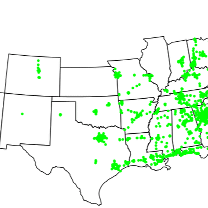
Simple R Application with Spatial Data
Project description: Created as a proof of concept, this simplistic R Shiny app gives a good example of what is possible for presenting and sharing geospatial data outside of the ArcWeb framework.
Why so Simple?
I like to use this app as an example as it is extremely quick to code up but combines a few interesting features such as:
- Real time CRS coordinate transforms and calculations.
- Web scraping of a current data set from a non-research oriented page.
- Reactive user input.
- Simple sharing of GIS based applications
This app is designed to simulate the now defunct Waffle House Index once hosted on the FEMA website. Waffle House is a restaurant in the southern USA. It rarely closes even in the face of extreme circumstances such as hurricanes as they are capable of running a reduced menu with no electricity. As such, FEMA used to monitor the operating conditions of Waffle Houses in order to judge the severity of local disaster conditions. Waffle house has three states of operation, Green for as normal, Yellow for reduced capacity menu, Red for full closure. My application scrapes the current locations for all Waffle Houses in operation in the USA via the Waffle House website, displays their location on a simple map, and allows the user to click on the map to create a false disaster area with a bespoke killzone and wounded radius. Displaying these radii requires on the spot transformation between the WGS84 and ESPG 9822 projections, geographic distance calculation, and image display. This application can be shared simply via its URL and requires no setup from end users.
Though this application is a bit tongue in cheek and extremely barebones, it shows that sharable, interactive, GIS based applications can be made quickly to present ideas and data in ways that capture your audience’s attention. Data science is an extremely exciting field and the conclusions we draw can be world changing but if we cannot transmit the knowledge we discover in ways palatable to non-analysts, then no matter how groundbreaking our research, no one will pay it any mind. This R shiny app template proves that, with the absolute minimum of time investment, we can create visualizations that better promote end consumer engagement and understanding of our results.
Try out the app here. Waffle House Index Simulator.