Edward Leland

Data Scientist | GIS Specialist | Archaeologist
LinkedIn Profile
Datacamp Certifications/Projects
Selected Presentations
PCA to Identify Missing Data Values
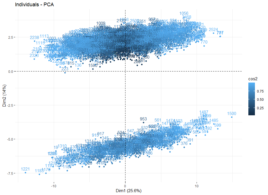
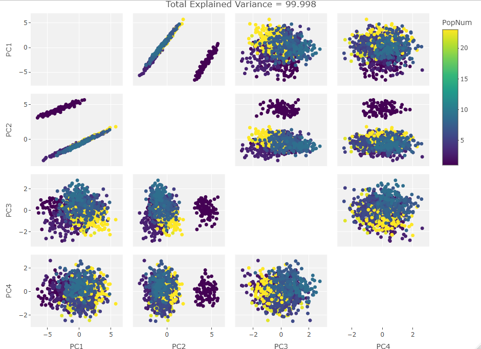
Project description: I was interested in looking at some osteological data. Howells craniometric data set is freely available and relatively large: 2524 human individuals over 28 populations. There is supposed to be a description of the structure of the data available on the source site but when I accessed it that link was broken. Knowing little else than that the data had 82 separate craniological measurements, I ran a PCA to see if any clustering or trends evolved in PC space so I could analyze a reduced number of dimensions. This resulted in the biplot below and motivated me to run down the cause of such extreme clustering behavior.
Howells’ Data Set
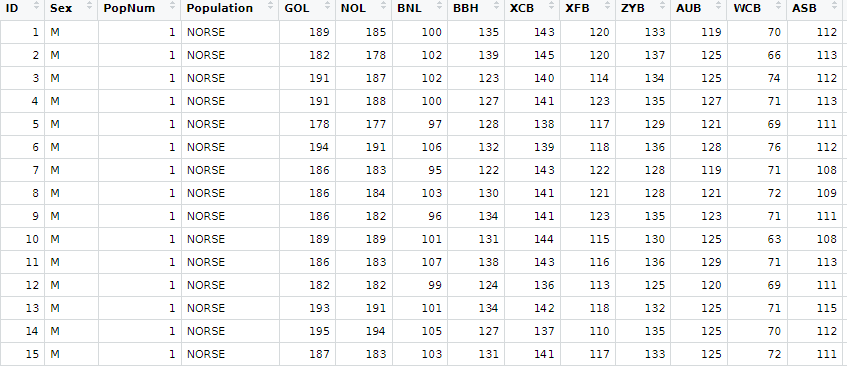
The data from the source site is downloadable as two groups. One is the normal Howells crania (2524 crania) and the other is the so-called test set (524 crania). The latter is a collection of crania that were either not whole or had some other deficiency that differentiated them from the normative homo sapien skull. I worked with the normal data set as it had more individuals and as a novice to the world of craniometry I wanted to keep my data as representative of the norm as possible. The Howells set has 82 craniometric measurements in mm, variables for Population in both numeric and string form, Sex, and an individual ID.
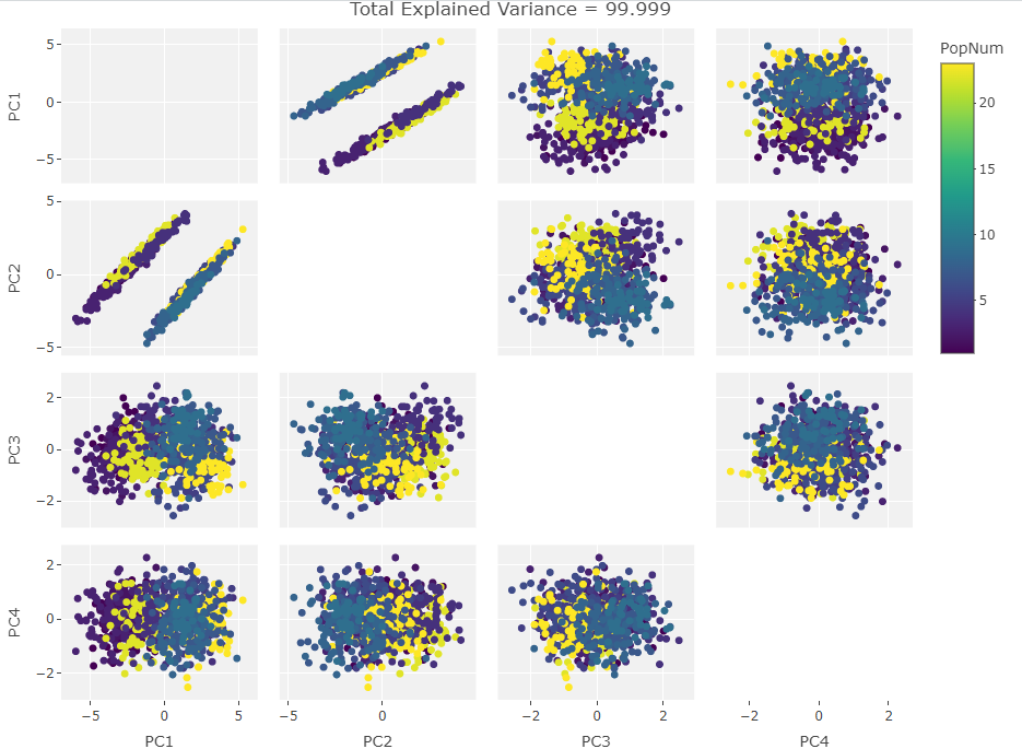
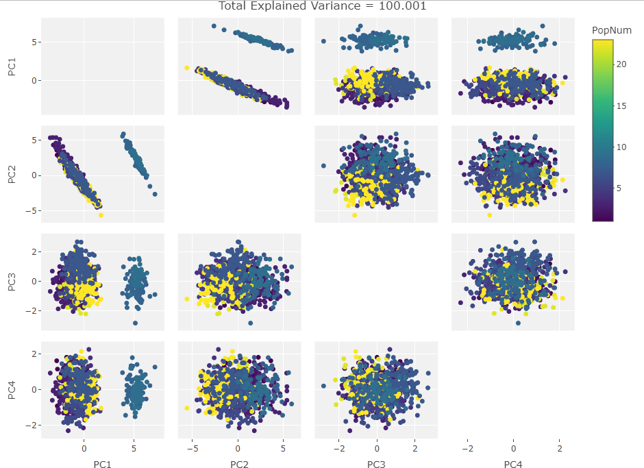
Initial PCA Investigation
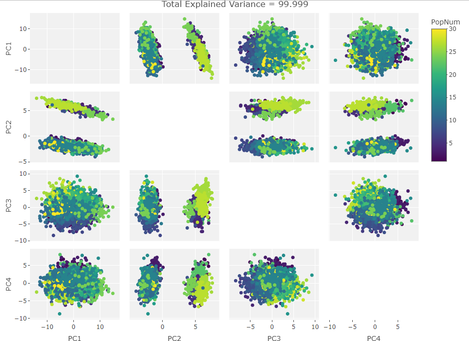
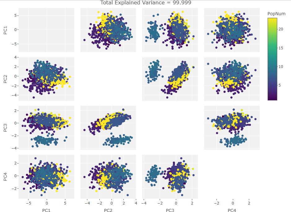
After generating the first biplot I created the following figure to see if this behavior continued with other PC components:
At this point it was obvious that PC2 was driving the clustering so I made the variable vector plot below to see if anything jumped out:
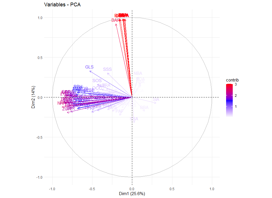
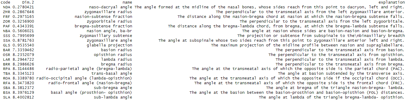
The cluster of highly positive vectors seemed to be the cause of the clustering but there were too many variables in the plot to figure out their names visually. From here I looked into the loadings on PC2 and discovered that the 11 largest were an order of magnitude larger than all the rest. As I was new to craniometrics I didn’t know the conversion from the three letter codes to what the measurements actually meant. I found this publication that described the codes and even mentioned that the variables I was interested in apparently came from a later study. I converted the pdf to .csv tables, read them into R, and added them to the Howells set:
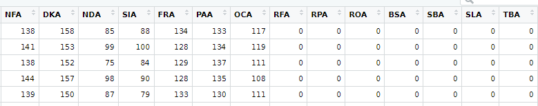
From here, I separated the original data set by their position along the PC2 axis in order to grab the two clusters. I then ran a Welch’s t-test to check for significant differences in the means of the different variables. This resulted in some strange results where the t-tests reported means of zero for some variable columns. Looking at the smaller groups data frame I was able to see that there were missing values represented as 0 in those variable columns. The missing data columns were the same variables that had the high loading values in PC space so everything started making sense.
The missing data was causing a ton of variability. However, there were only 662 individuals with missing values and 1862 individuals with complete data. I believe this is why the variation effect was captured in PC2 as the missing data individuals comprised only roughly 1/5 of the total data.
PCA Experiments
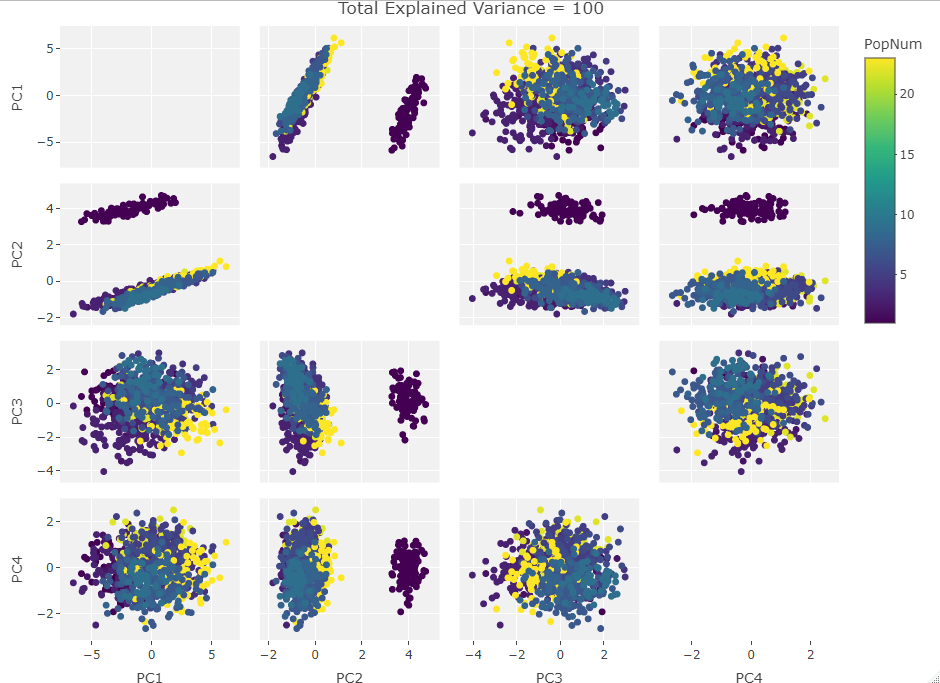
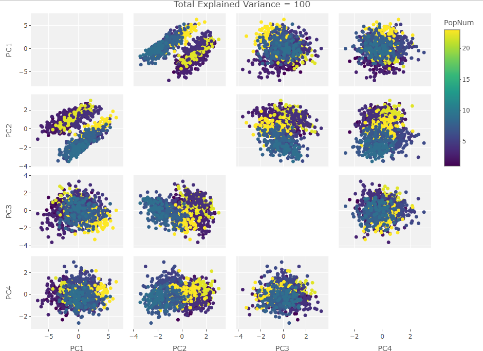
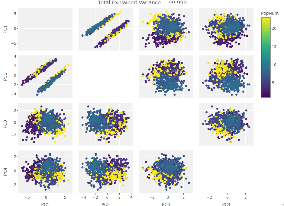
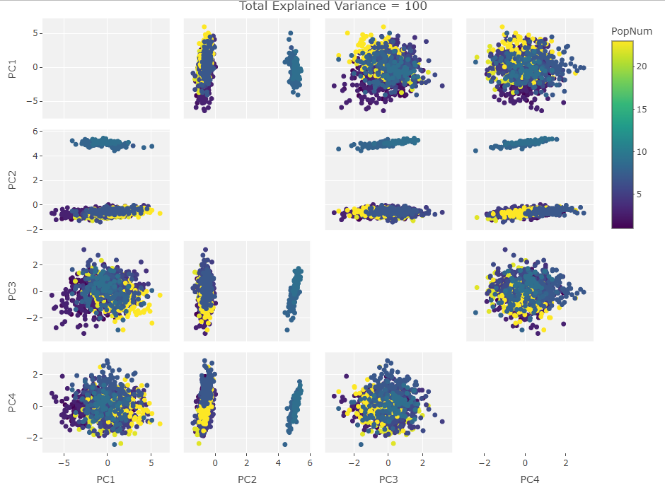
So how to approach this analytically? I could rip apart the R PCA algorithm and take the equations into pure number space but that would remove the visual component that first drew me to this behavior. Instead I decided to plot the PCA results after manipulating a test set of data. I made a data frame of the first 1000 individuals in the Howells data set with only the first 10 craniological measurements. Next I iterated over the frame taking one craniological measurement column and causing 100 then 500 then 900 of the data points in that column to be zero. Then I ran PCAs over these subsets and plotted them. After that, I added another column in, repeated the missing data adjustments, and ran the PCAs. I did this until I saw the clustering move fully into the first PC. The plots are below:
One Variable Manipulated:
Two Variables:
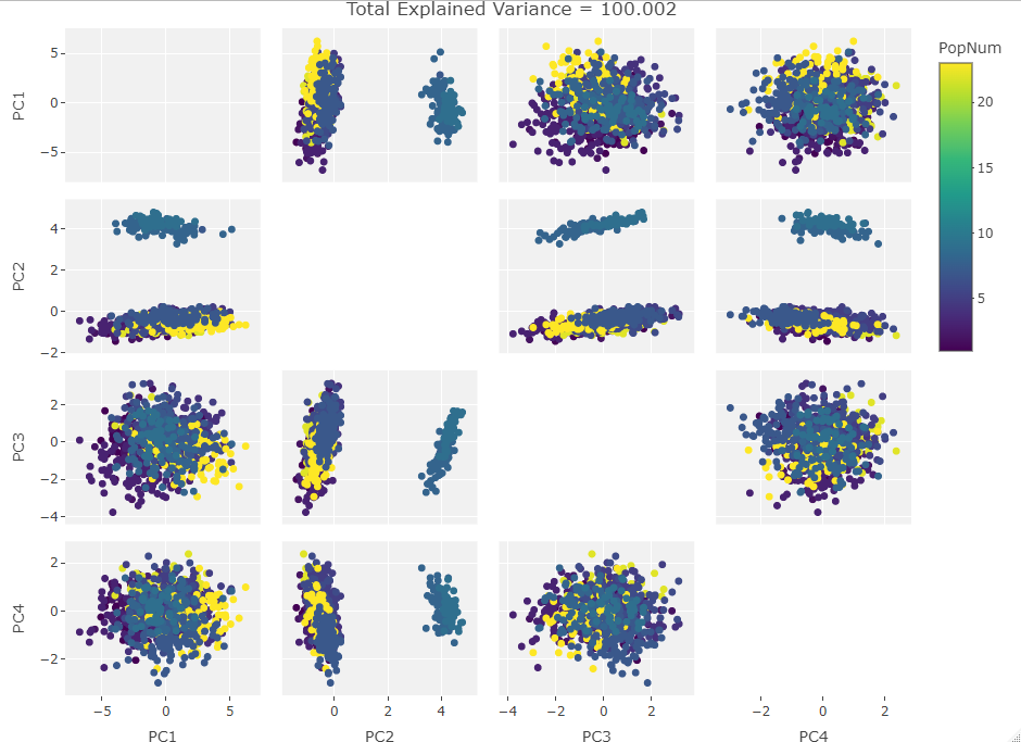
Three Variables:
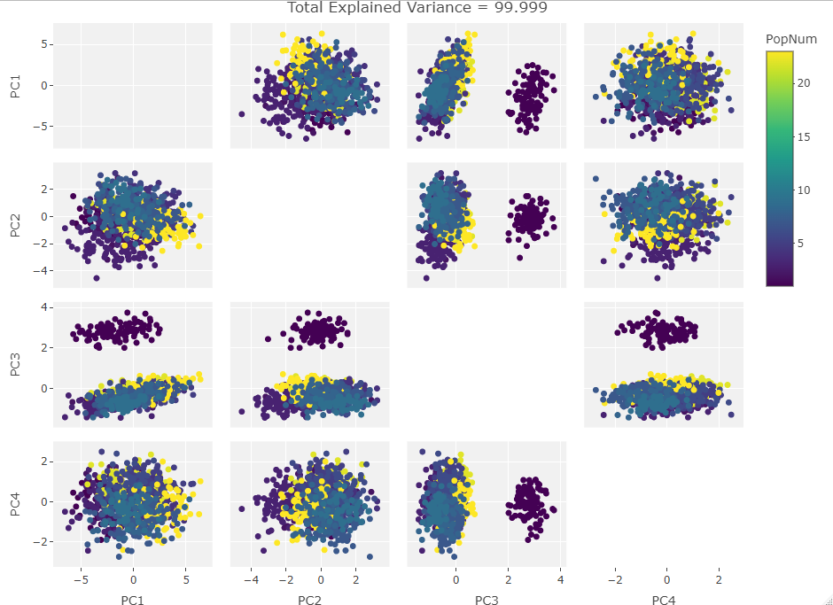
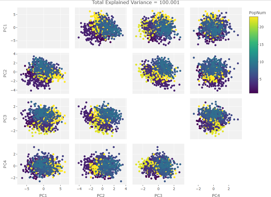
Four Variables:
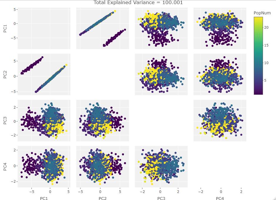
Finally we start making sense of the data. PC components are affected by outlier groups. For each group of plots, the middle plot corresponding to 500, half, of the manipulated columns’ data points are set to 0. But since half the data is affected, the PCA still shows relatively normal clustering behavior as the missing data isn’t a small outlier group, it is now considered a large and thus valid trend in the data space resulting in normative clustering. The 100 and 900 missing data point groups (plots 1 and 3 in each set of 3) create outliers of either missing data or complete data.
Seeing how the first set of plots (only one manipulated variable column out of 10 total) shows the clustering effect in PC3, the second and third sets (2 and 3 manipulated variables respectively) show clustering in PC2, and the fourth set (4 manipulated columns) show clustering in PC1. This means that the PC that clustering due to missing data set to some arbitrary value occurs in is determined by the number of variables affected by the missing data. For this data set we saw that fewer affected variables meant that this clustering moved into higher PC components.
Further Considerations
Ok so what? Why should we care about missing data like this when there are tons of ways to find missing values. To me this opens the door for some fun experiments in PC space. I’ve described the clustering behavior visually here but if we attacked this purely mathematically it might be interesting to see the exact factors that affect which PC shows clustering and the divisions between PC clustering levels. I have a feeling it is a function of n number of variables with k missing values but there could be some fascinating behaviors with specially constructed test sets. I may see what happens with this if, instead of missing data, I “corrupt” some variables with increasing random noise. Regardless, this little foray into craniometric PC analysis has shown that when confronted with interesting behavior, even if that behavior is driven by badly collected data, it is worth investigating its source.
Here at the end I will freely admit there are easier ways to come to these conclusions, heck there are even easier numerical ways to look for missing data. However, to me at least, there is something beautiful about a visual solution to a numbers based problem.